


The visual elements that direct the eye are: Contrast, Color, Focus, and Size (balance). Contrast and Color are two elements you have control over during the shooting process and in post. In this article we will explore how these two elements draw the eye of the viewer. Contrast Contrast is the difference in luminance value (brightness/darkness) between objects or areas. The greater the difference in luminance values the greater the contrast. A common misconception about how the eye reads a photograph is, ?The eye will go to the lightest area of a photograph.? Look at the following image: 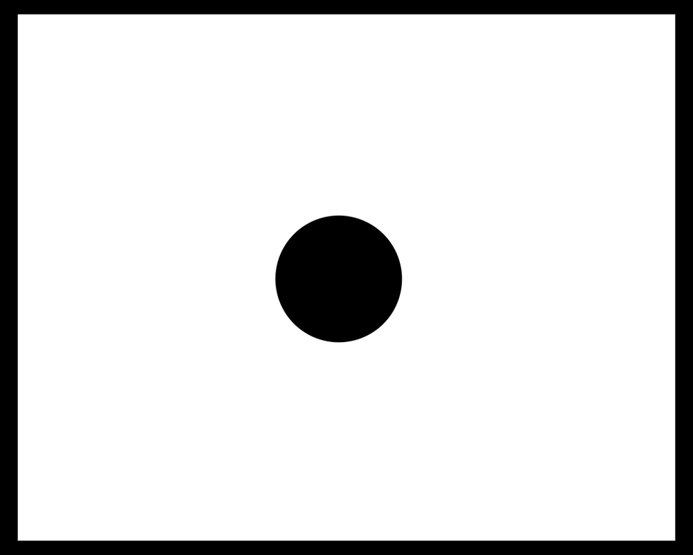 Did your eye go to the ?lightest? area of the image? Or did it go to the big black dot in the center. This test reveals two things: first that popular advice on photography can easily be wrong (no surprise), and second there is another principle at work here. Your eye doesn?t go to the lightest area, instead it goes to the area of greatest contrast. That is the true principle. It doesn?t matter whether the area is in the center of the image, on a Rule of Thirds intersection, or in the corner. Your eye will look for and find the area of greatest contrast. There are several ways to apply this knowledge to our images. We can do this as part of our process while shooting, or after in Photoshop or the darkroom. If you know where you want people to look, if you know what your subject is, frame in a way to increase the contrast of a subject. Get low so a lighthouse is silhouetted more against the sky, or position your model against a solid color background, change your angle or move your subject. This is part of what it means to visually separate your subject from the background (the other part being removing visual confusing elements from behind your subject).
  In post-processing consider adding contrast to areas where you want people to look, and/or removing contrast where you don't want them to look. Dodge and burn, or use curves and masks to make these changes. Eyes and faces are good places to add contrast even though we will look at them naturally. Stacking multiple elements together, like contrast and focus, will lead the eye much more. The viewer can not help but look where you want them to.
 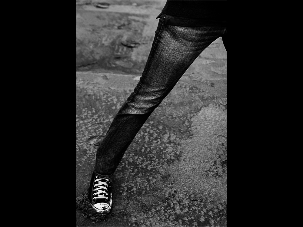 In the previous image the contrast of the shoe and laces was increased to draw the eye down to it. There are also contrast areas in the upper thigh, knee, and in the line of the leg against the sand. It is all designed to get the eye to travel down. The contrast acts as a magnet and draws the eye down from the leg to the shoe. The goal was to lead the eye with the same motion of the leg and foot pressing into the sand. This was not a conscious decision while shooting. The picture was framed to accentuate the length and shape of the leg, then the contrast was adjusted in Photoshop to increase the impact. Color
  Color can be broken down into three components; Hue, Saturation and Value. Hue - what we ordinarily think of as color?red, orange, yellow, green, blue, violet. You can think of them as the parts of a rainbow, minus the indigo, which is considered to be a part of blue spectrum (I miss indigo, although not as much as I miss Pluto being a planet).
 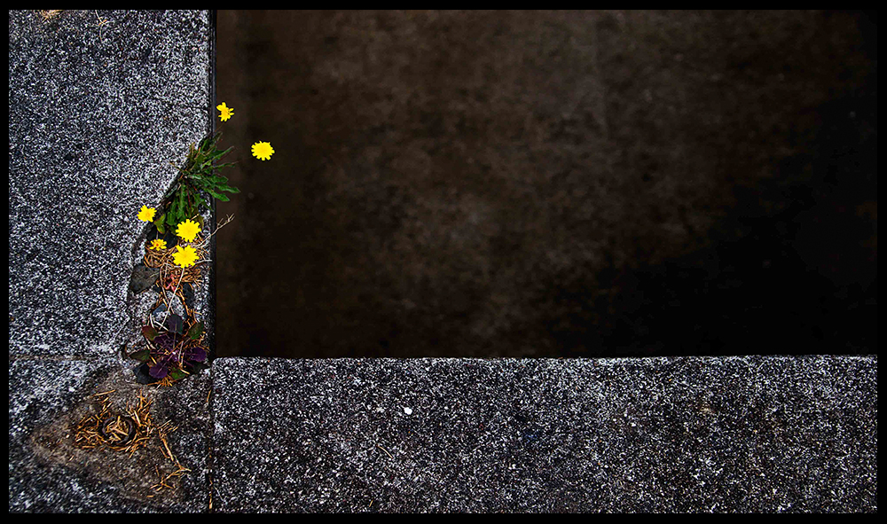 Saturation - refers to intensity from pure color to gray. Saturated colors are considered to be vibrant and bright, desaturated colors are duller and closer to gray. This is not to say saturated colors are ?better? and desaturated colors are boring and lifeless. Value - how light or dark the color is. This is also referred to as lightness or brightness. Brightness also has an effect on how saturated we perceive a color to be, but that is a subject for another day. These aspects are a simplification. Color is a complex subject. Its study involves psychology, biology, physics and even linguistics. For our purposes we are only concerned with how color draws the eye, and how we can use it as photographers to direct attention. Color has a very strong pull on the eye, which favors more saturated colors over desaturated ones. A spot of color against a desaturated background will quickly draw the eye. This is why the selective color technique works so well. If your mostly B&W image includes colored eyes or lips, the eye will be drawn to the area. For this reason you want to make sure your point of interest is the colored part. Look at the examples below.
 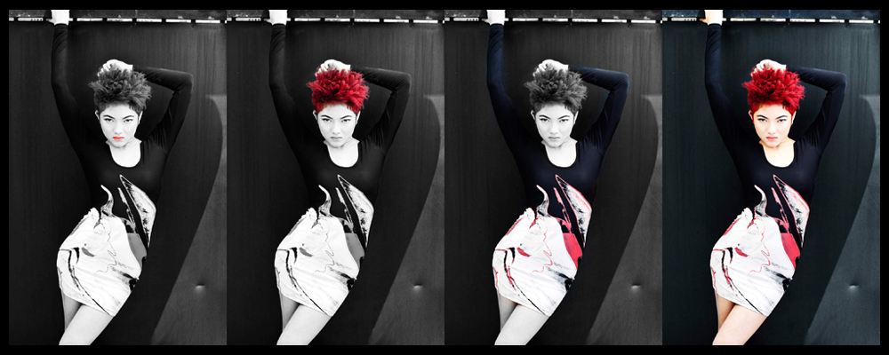 In the first two images the color helps draw the eye to the face. The selective color on the dress in the third image is the least successful at leading the eye to it. The elements that direct the eye are not created equal. As attractive as color is, it cannot always overcome the psychological draw, and the tonal contrast of the face.
  Because each color has a brightness value, it works the same as contrast. If your colors have a low contrast compared to another part of the image, it will not draw the eye as well as a color with a higher contrast. It is actually easy to get the eye to overlook a color in favor of contrast. The black spot is the area of greatest contrast so your eye will go to it. This can also be considered a form of pattern interruption since we are breaking up the yellow field with the visual contrast of the black dot. If your color also happens to be in the same area as your greatest contrast then you have an area the eye will be very drawn to. The reason eyes are very compelling, they present an irresistible combination of color and contrast.
 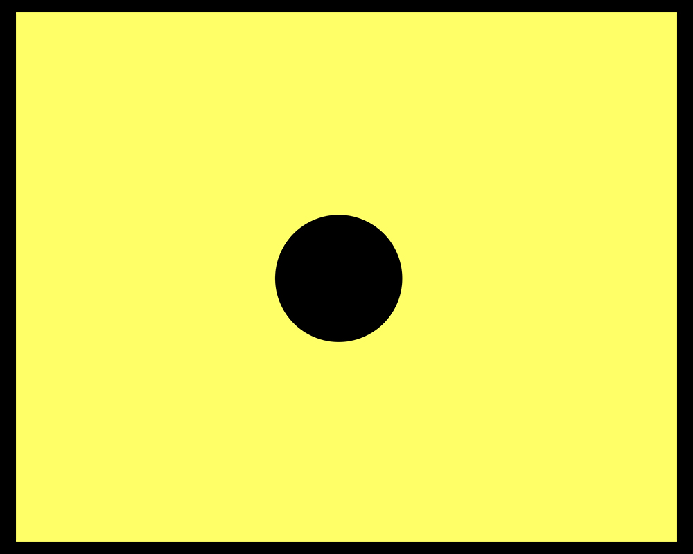 Contrast and color are not always controllable while shooting, in those cases we can use post-processing to heighten the impact. Lowering the contrast or saturation of the background, or increasing them in subjects or points of interest, are two ways to direct the eye. This is one of the most compelling reasons for editing software to be part of a photographer?s workflow. Process your images, not only to fix mistakes, but to direct the eye and bring images to life. It is by understanding how the elements in images work together, and using the tools to control them, we create photographs with vitality. It is how we create stronger photographs that tell better stories.
 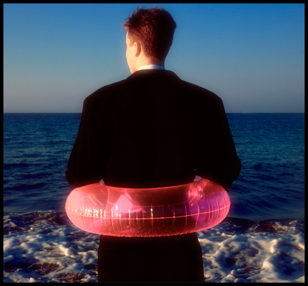 The next part of the series will cover focus and size and how they work to direct the eye. If you missed part 1, click here to read Directing the Eye Part 1 - Psychological Elements
Did your eye go to the ?lightest? area of the image? Or did it go to the big black dot in the center. This test reveals two things: first that popular advice on photography can easily be wrong (no surprise), and second there is another principle at work here. Your eye doesn?t go to the lightest area, instead it goes to the area of greatest contrast. That is the true principle. It doesn?t matter whether the area is in the center of the image, on a Rule of Thirds intersection, or in the corner. Your eye will look for and find the area of greatest contrast. There are several ways to apply this knowledge to our images. We can do this as part of our process while shooting, or after in Photoshop or the darkroom. If you know where you want people to look, if you know what your subject is, frame in a way to increase the contrast of a subject. Get low so a lighthouse is silhouetted more against the sky, or position your model against a solid color background, change your angle or move your subject. This is part of what it means to visually separate your subject from the background (the other part being removing visual confusing elements from behind your subject). In post-processing consider adding contrast to areas where you want people to look, and/or removing contrast where you don't want them to look. Dodge and burn, or use curves and masks to make these changes. Eyes and faces are good places to add contrast even though we will look at them naturally. Stacking multiple elements together, like contrast and focus, will lead the eye much more. The viewer can not help but look where you want them to. In the previous image the contrast of the shoe and laces was increased to draw the eye down to it. There are also contrast areas in the upper thigh, knee, and in the line of the leg against the sand. It is all designed to get the eye to travel down. The contrast acts as a magnet and draws the eye down from the leg to the shoe. The goal was to lead the eye with the same motion of the leg and foot pressing into the sand. This was not a conscious decision while shooting. The picture was framed to accentuate the length and shape of the leg, then the contrast was adjusted in Photoshop to increase the impact. Color Color can be broken down into three components; Hue, Saturation and Value. Hue - what we ordinarily think of as color?red, orange, yellow, green, blue, violet. You can think of them as the parts of a rainbow, minus the indigo, which is considered to be a part of blue spectrum (I miss indigo, although not as much as I miss Pluto being a planet). Saturation - refers to intensity from pure color to gray. Saturated colors are considered to be vibrant and bright, desaturated colors are duller and closer to gray. This is not to say saturated colors are ?better? and desaturated colors are boring and lifeless. Value - how light or dark the color is. This is also referred to as lightness or brightness. Brightness also has an effect on how saturated we perceive a color to be, but that is a subject for another day. These aspects are a simplification. Color is a complex subject. Its study involves psychology, biology, physics and even linguistics. For our purposes we are only concerned with how color draws the eye, and how we can use it as photographers to direct attention. Color has a very strong pull on the eye, which favors more saturated colors over desaturated ones. A spot of color against a desaturated background will quickly draw the eye. This is why the selective color technique works so well. If your mostly B&W image includes colored eyes or lips, the eye will be drawn to the area. For this reason you want to make sure your point of interest is the colored part. Look at the examples below. In the first two images the color helps draw the eye to the face. The selective color on the dress in the third image is the least successful at leading the eye to it. The elements that direct the eye are not created equal. As attractive as color is, it cannot always overcome the psychological draw, and the tonal contrast of the face. Because each color has a brightness value, it works the same as contrast. If your colors have a low contrast compared to another part of the image, it will not draw the eye as well as a color with a higher contrast. It is actually easy to get the eye to overlook a color in favor of contrast. The black spot is the area of greatest contrast so your eye will go to it. This can also be considered a form of pattern interruption since we are breaking up the yellow field with the visual contrast of the black dot. If your color also happens to be in the same area as your greatest contrast then you have an area the eye will be very drawn to. The reason eyes are very compelling, they present an irresistible combination of color and contrast. Contrast and color are not always controllable while shooting, in those cases we can use post-processing to heighten the impact. Lowering the contrast or saturation of the background, or increasing them in subjects or points of interest, are two ways to direct the eye. This is one of the most compelling reasons for editing software to be part of a photographer?s workflow. Process your images, not only to fix mistakes, but to direct the eye and bring images to life. It is by understanding how the elements in images work together, and using the tools to control them, we create photographs with vitality. It is how we create stronger photographs that tell better stories. The next part of the series will cover focus and size and how they work to direct the eye. If you missed part 1, click here to read Directing the Eye Part 1 - Psychological Elements